
Crafting Excellence: Responsive & Creative Design
In the dynamic realm of web design, the fusion of aesthetics and functionality is a delicate dance. Recently, I embarked on a journey to create a stunning digital presence with my project, ‘Responsive & Creative Design.’ This endeavor aimed not only to showcase my design skills but also to deliver a seamless user experience through a fully responsive, one-page website.
Designing the Canvas:
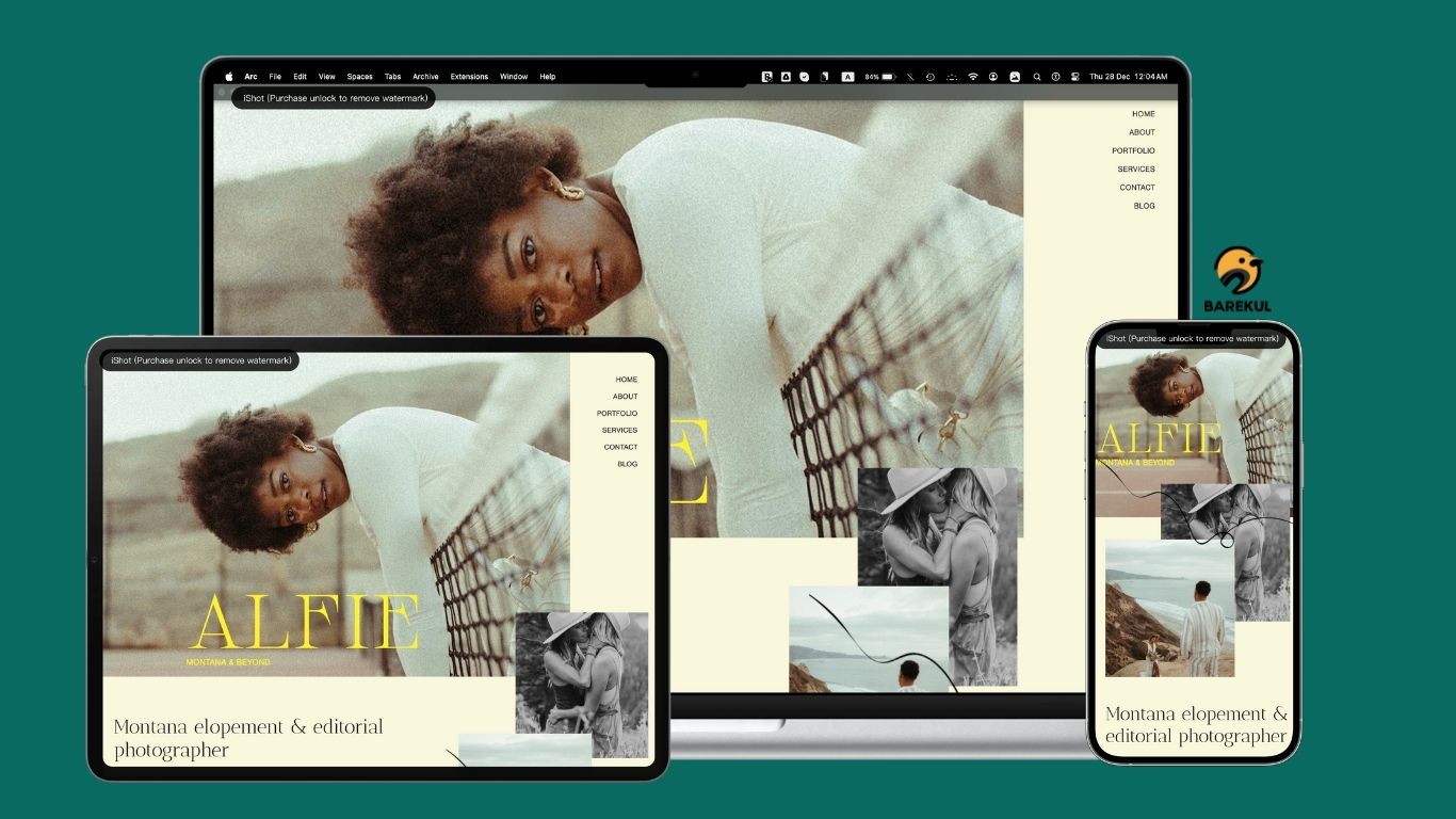
The canvas for ‘Responsive & Creative Design’ was conceived as a one-page website, a format that seamlessly guides visitors through a cohesive narrative. The design process was a meticulous exploration of color palettes, typography, and imagery, all geared towards creating a visually engaging and harmonious user experience.
Responsive Magic:
A key pillar of modern web design is responsiveness. ‘Responsive & Creative Design’ took this principle to heart, ensuring that the website seamlessly adapts to various screen sizes and devices. Whether viewed on a large desktop monitor, a tablet, or a smartphone, users experience a consistently fluid and visually appealing interface. The responsive design not only enhances user satisfaction but also aligns with contemporary best practices for accessibility and SEO.
Navigational Simplicity:
The one-page structure demanded an intuitive navigation system. Anchored menus, smooth-scrolling features, and strategically placed call-to-action buttons facilitate effortless exploration of the site. This simplicity in navigation ensures that visitors can absorb the content seamlessly, without the distraction of complex menus or convoluted structures.
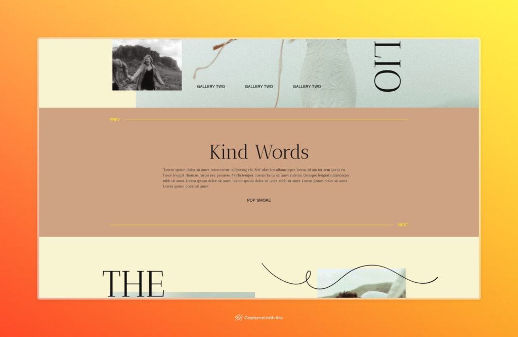
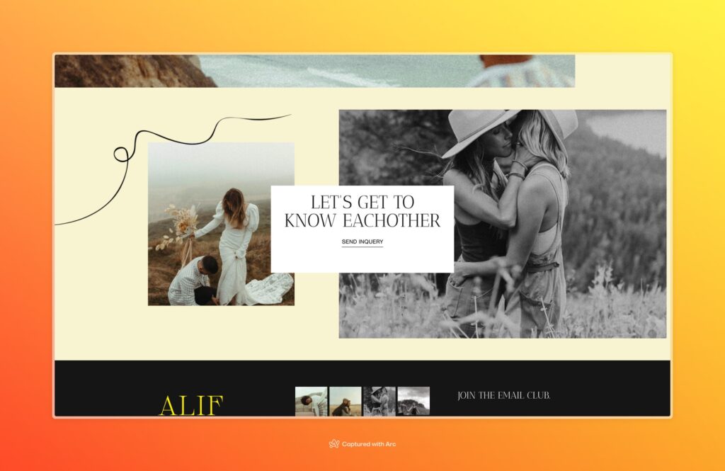
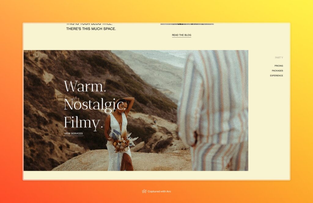
Immersive Visual Storytelling:
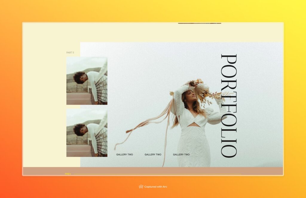
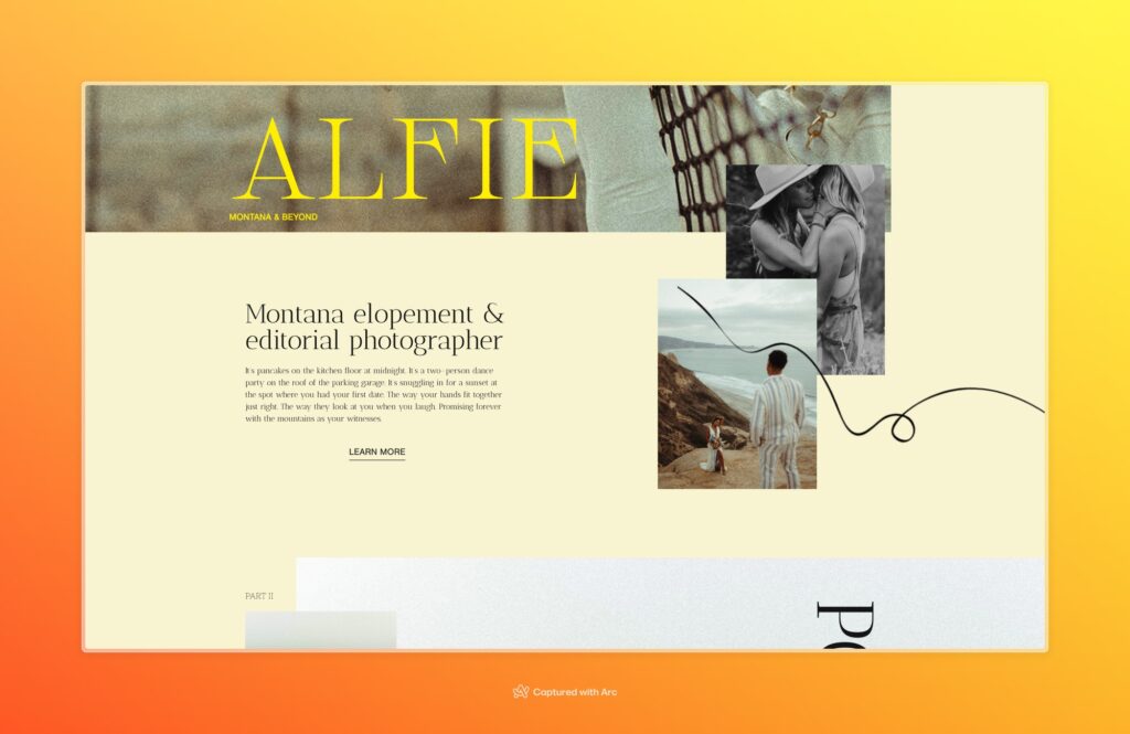
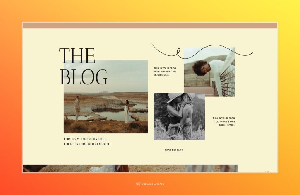
Visual storytelling takes center stage in ‘Responsive & Creative Design.’ The carefully curated visuals and graphics serve a dual purpose – they not only enhance the aesthetic appeal but also convey the essence of the content. Strategic use of imagery, coupled with captivating design elements, creates an immersive journey for the user, making the website more than just a collection of pages but a visual story.
Interactive Elements:
To elevate the user engagement, interactive elements were strategically incorporated. From animated transitions to parallax scrolling effects, each interactive feature was thoughtfully integrated to captivate and retain the user’s attention. These elements not only contribute to the overall aesthetic but also add a layer of sophistication to the user experience.
Technological Backbone:
Behind the scenes, ‘Responsive & Creative Design’ boasts a robust technological backbone. The use of cutting-edge web technologies and coding practices ensures not only a visually appealing design but also optimal performance and reliability. This commitment to technological excellence underscores the project’s dedication to delivering a website that not only looks good but functions seamlessly.
Conclusion:
In the ever-evolving landscape of web design, ‘Responsive & Creative Design’ stands as a testament to the power of marrying creativity with functionality. The project’s one-page design, coupled with its responsiveness and immersive visual storytelling, creates a memorable user experience. As we continue to push the boundaries of what is possible in web design, this project serves as a beacon of inspiration, illustrating the potential for excellence in the marriage of design and technology. ‘Responsive & Creative Design’ is not just a website; it is a journey, an experience, and a testament to the boundless possibilities within the realm of digital creativity.